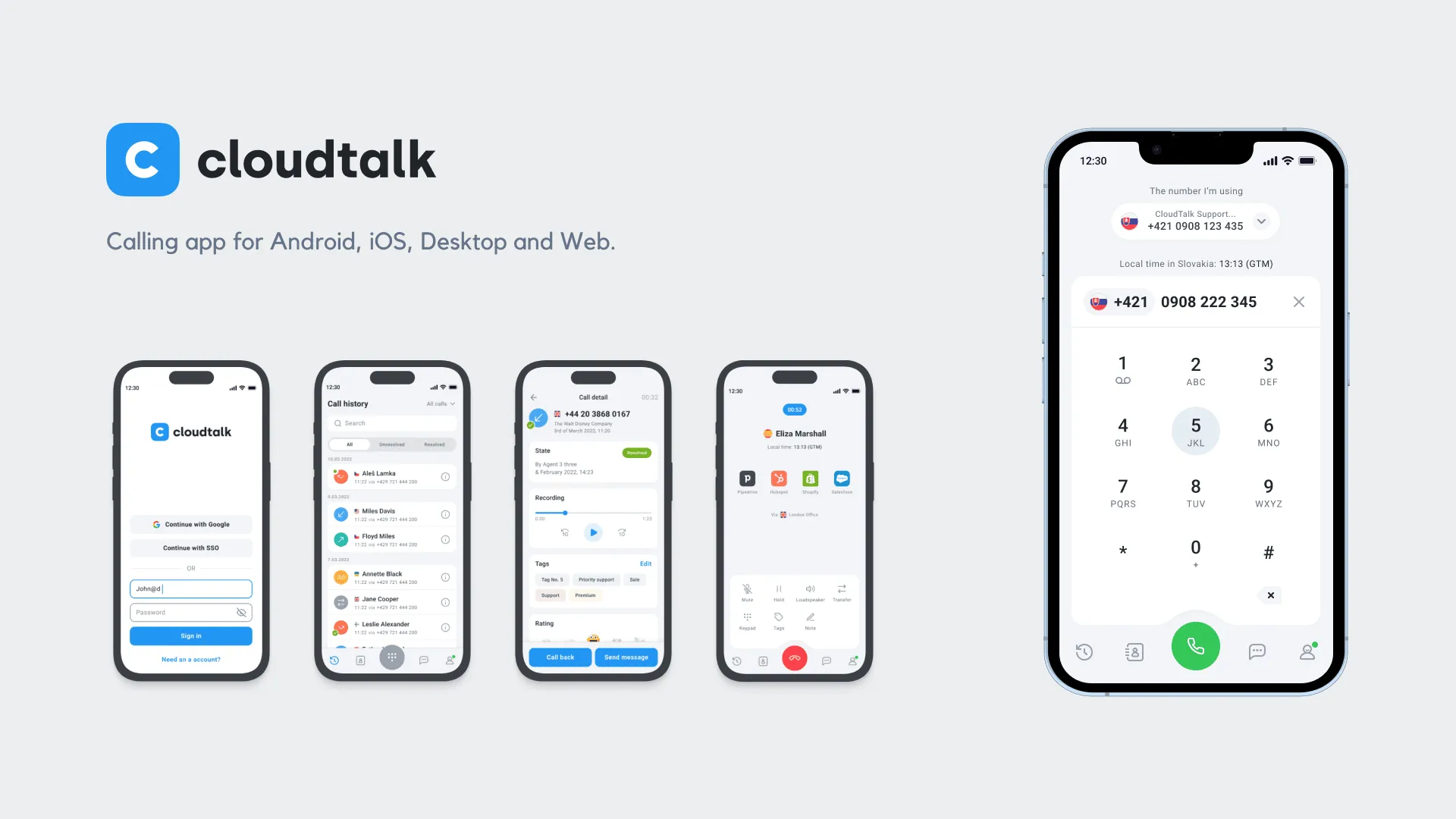
Project Overview
CloudTalk is an intelligent cloud-based call center solution to improve sales and customer support, but its design looks outdated compared to its competitors, and parts of its user experience are unpolished.
CloudTalk app struggled to scale alongside the fast growth of the company, when the number of employees quadrupled. The rapid implementation of features hurt usability, and performance and reliability issues increased exponentially.
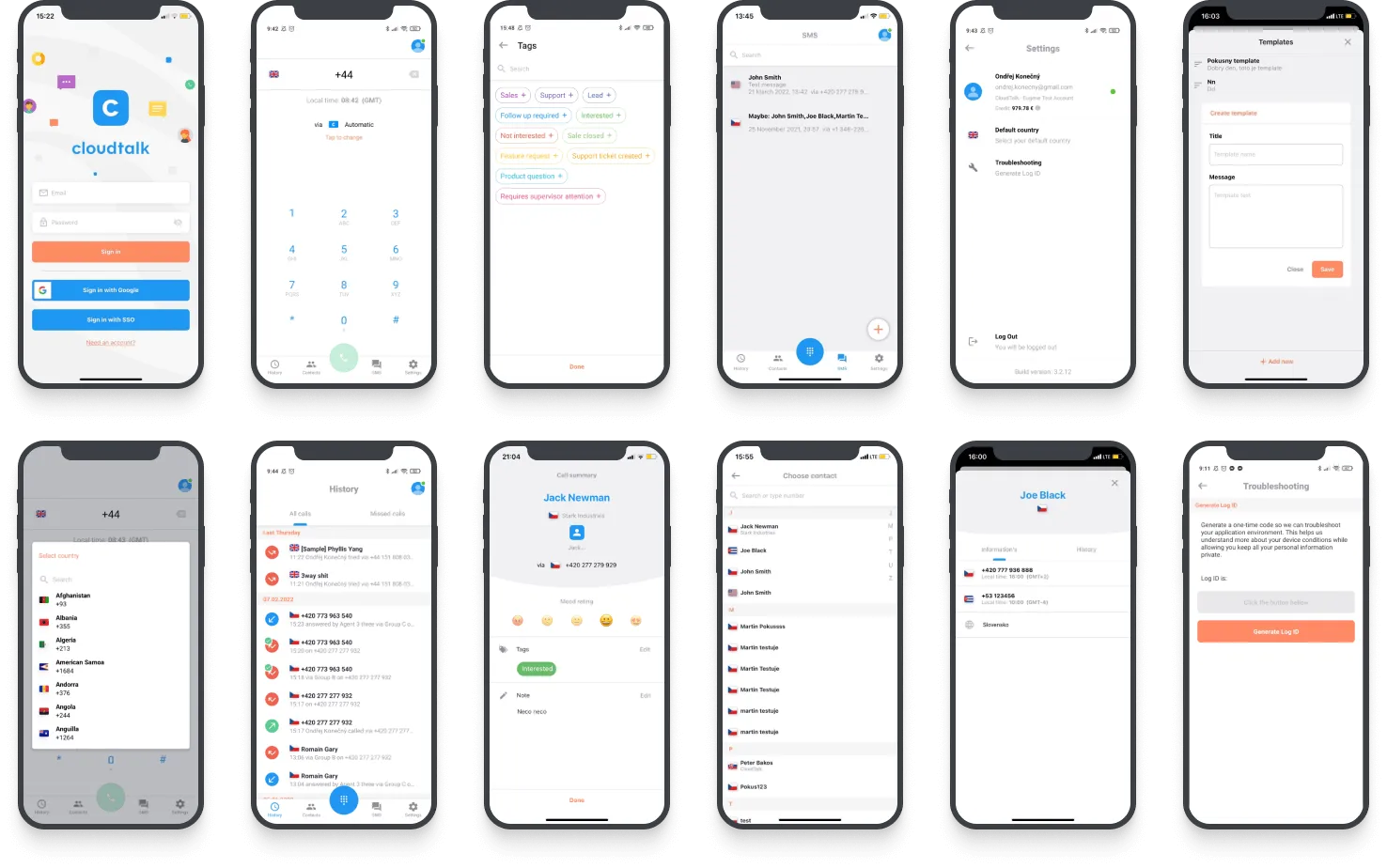 Original mobile app created and launched in 2021 was based on the desktop version that was created in 2020 for MacOS, Windows, Linux, and Web. We had the unique opportunity to design apps for each platform to achieve a better experience.
The Goals We Had
The highest priority was to improve user experience and reduce the biggest pain points that users have when interacting with the app. Another goal was to change the visual appearance so that the interfaces did not lag behind the competition.
Stabilizing the design process was the next step that needed to be done. Creating an environment that other potential team members can join over time is another priority. Enforcing the design process was the first step.
We also wanted to reduce the number of tickets sent to customer support, increase the NPS score, and arouse interest among new users who log into the application for the first time — so far, the reviews of the app have not been positive.
My Role
I was hired to redesign all apps from a usability perspective, create product design foundations, a component library, improve user and developer experiences, and ensure that everything is implemented properly and consistently.
My responsibility was to lead the redesign project and take care of research and audits, interaction design, interface design, usability testing, improve existing features, and create new ones.
We partnered with Outloud studio, who took care of the visual identity and helped me improve some of my thoughts on design review sessions and bring some fresh ideas.
The app launched globally on August 16th, 2022.
Shared Understanding
I was thinking about the fastest way to get into the project, so together with product manager Martin, we came up with the idea of creating longer, intensive, and regular meetings.
Together we went through the applications from start to finish and explained how everything works, what data we have, and what we don’t understand.
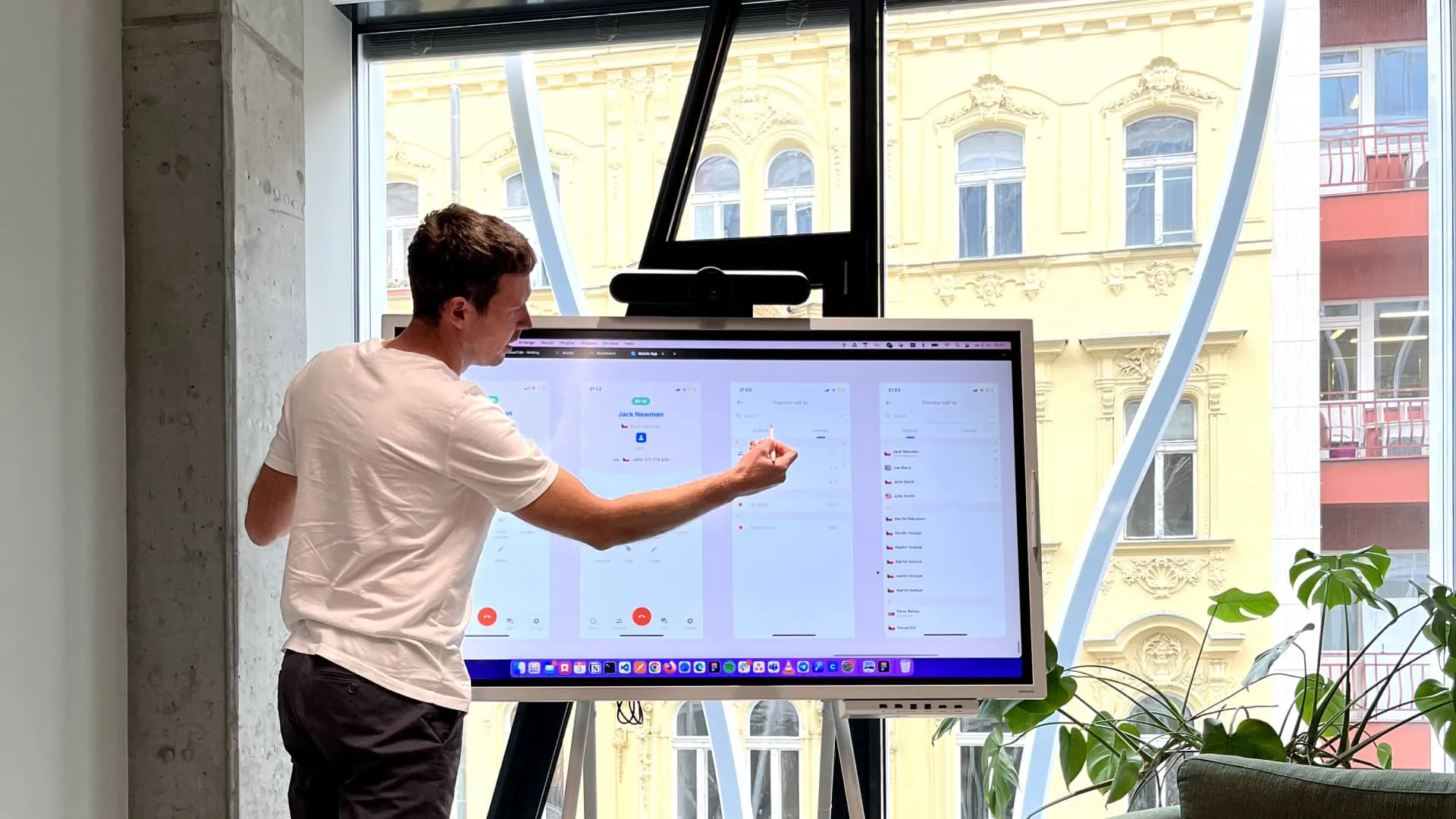 Two times a week we held a workshop for three to four hours to discuss all the necessary information. The workshops helped me quickly orientate myself in the application and find out the opinions of other people in the team.
“Shared documents aren’t shared understanding. Shared understanding is when we both understand what the other person is imagining and why.”
— Jeff Patton
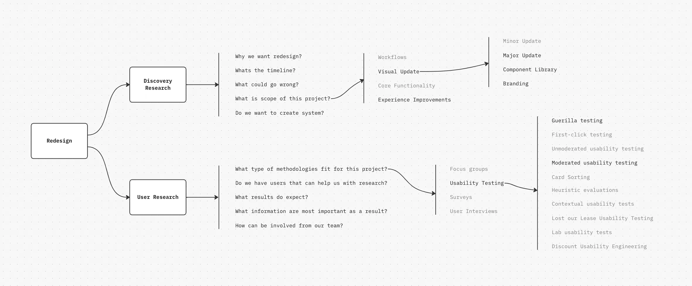
We clarified the scope and chose the most suitable way of proceeding, and selected the frameworks that are suitable for our case. This will give us a better chance of success.
By creating a decision tree, we gained an overview of what we want to do, what we don’t want to do, and what the sequence should be.
Audit
I went through the application to get an overview of the issues that I thought might be problematic. I didn’t want to think in systems at this point, and the output should be materials for interface changes.
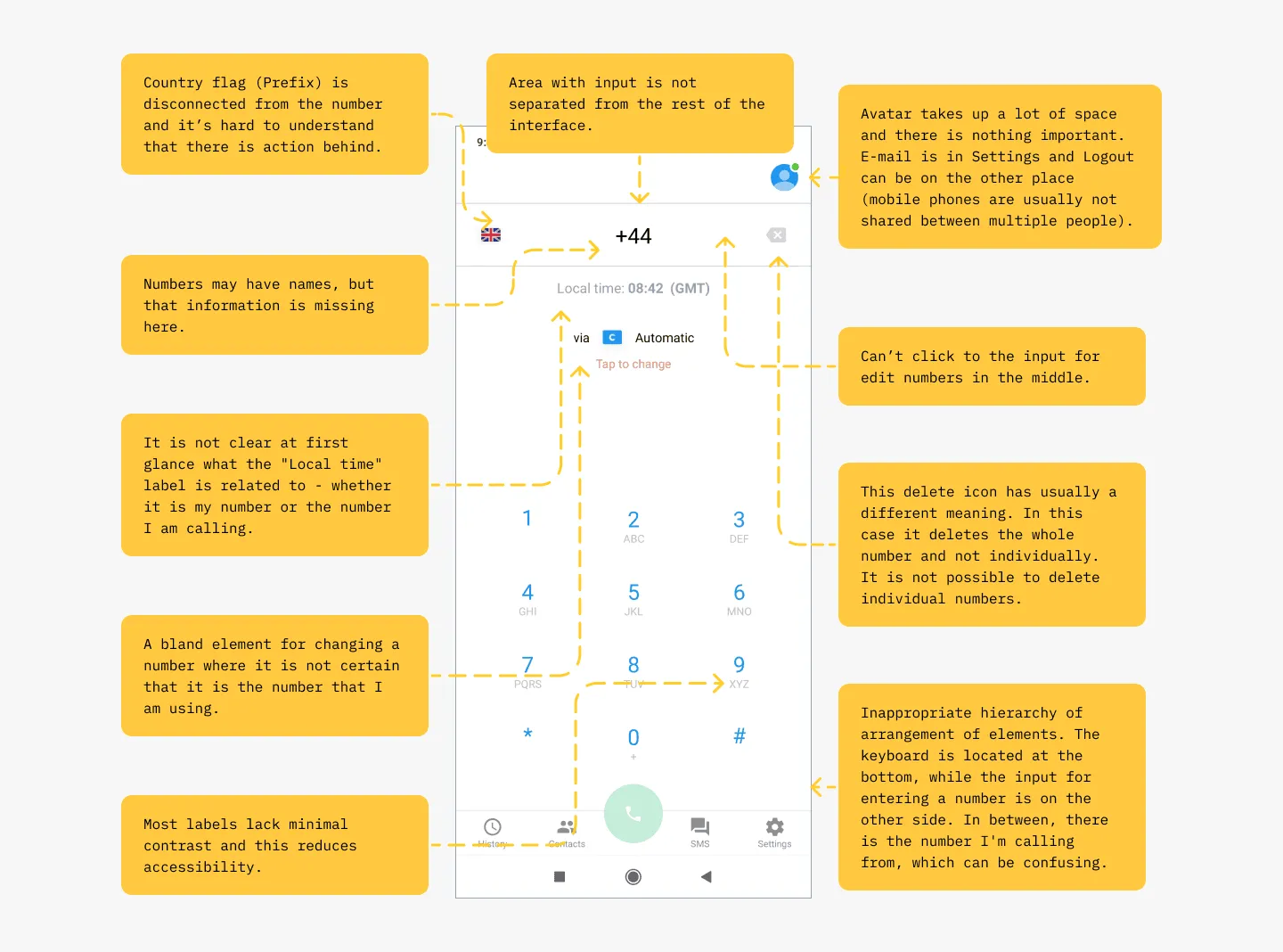
Analyzing the user interface helped me get a basic overview of potential problems that users might encounter. It is also a good way to prepare materials for usability testing.
It wasn’t necessary to test everything with users because it was more efficient to fix these obvious problems straight away. This was also the reason why I spent a week analyzing and evaluating the current design in order to have materials in front of me for new changes.
Focusing on Interactions
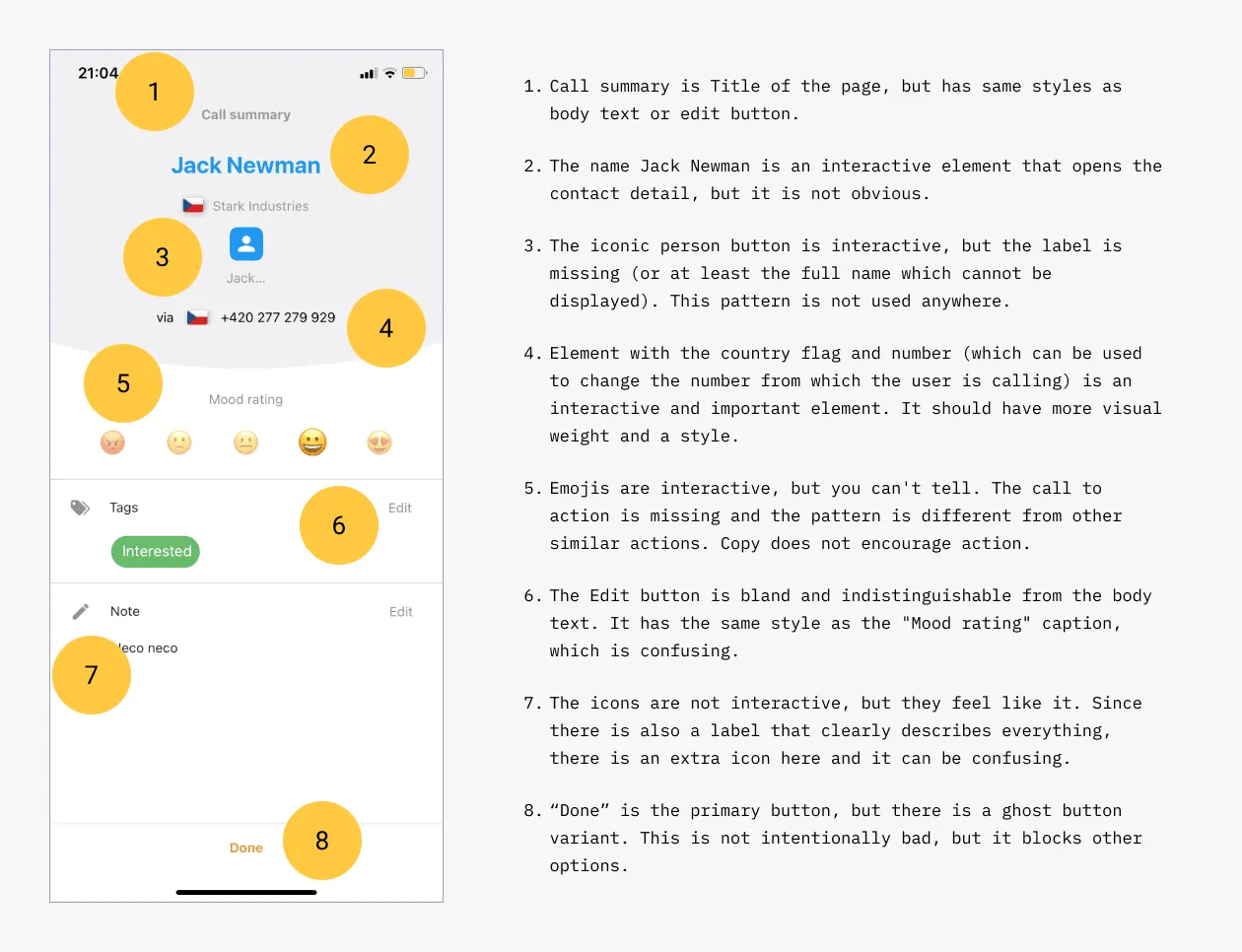
After the audit was done, I went through all the screens again — this time focusing only on interactions. A lot of elements in the application seemed interactive, but at the same time, they were only decorative (and vice versa).
This practice helped me find out the individual relationships between elements and get a basic overview of components, patterns, hierarchy, and workflows. I started to become more and more aware of the problems the app had, and ideas for improvements started forming in my head.
Making Sense of Interface Mess
In order to start working on the changes, it was necessary to make an interface inventory of components and patterns. This gave me an overview of how the interface is built and how individual elements are connected to others.
This meant focusing on accessibility, copywriting, layout, information architecture, visual hierarchy, and individual components and patterns, for which I prepared another batch of audits later in the process.
“UI should match the presentation to the expectations and capabilities of the user. It has to balance legibility, readability, typography, symbolism, multiple views, and color to communicate successfully.”
— Ankita Gupta
Component Inventory
Since I also had the task of preparing the materials for the design system, I wanted to go through all the components so that we could reduce their quantity and unify the interface with consistency.
For users, inconsistency can cause frustration, more difficult orientation in the interface, increase the risk of errors, and increase the time it takes to obtain the necessary information.
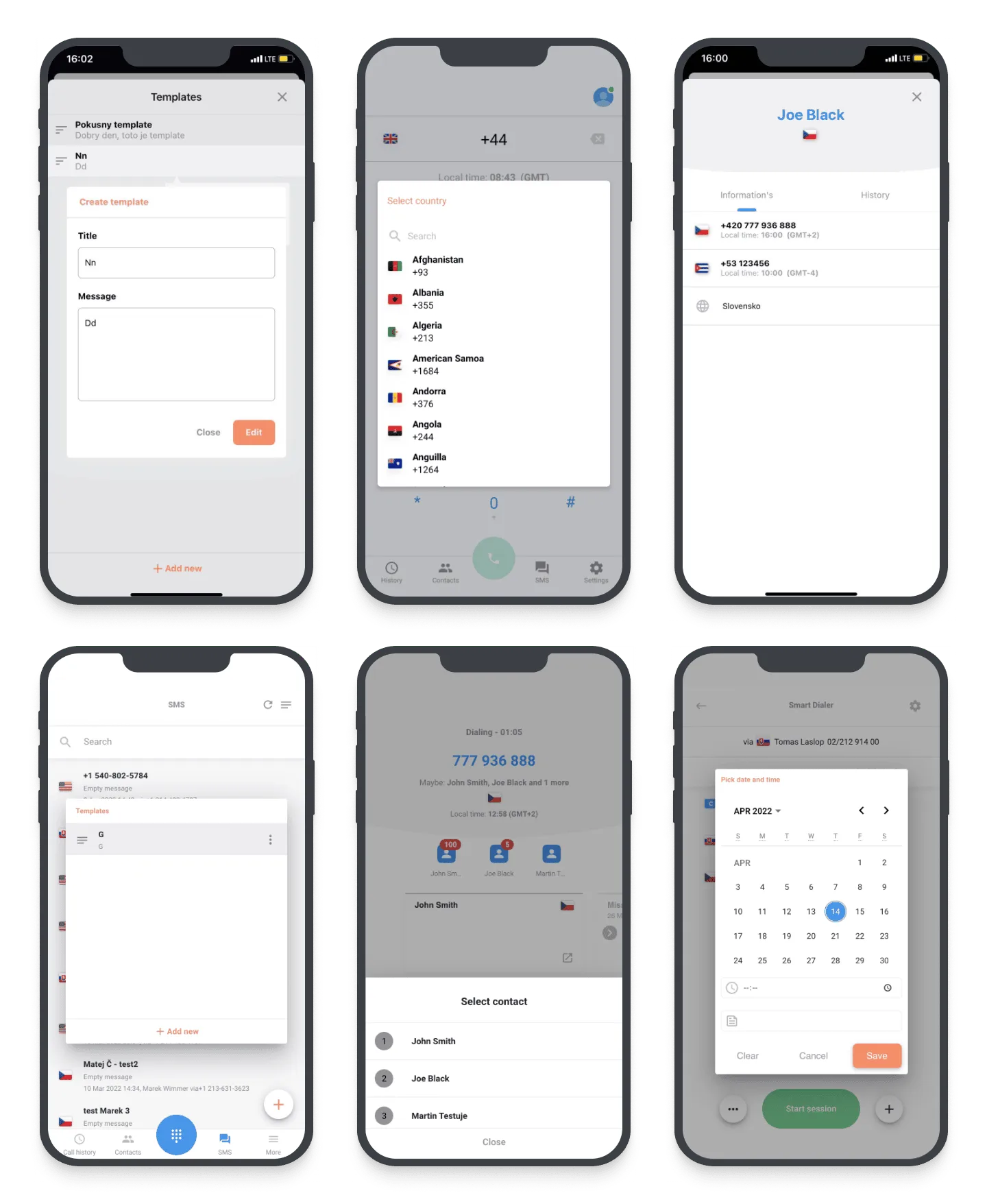 An example of inconsistency in the Dialog component. There are several different variants in the interface that have the same function. Even the most similar components differ in various details, and this seems unprofessional and untrustworthy.
Pattern Inventory
I chose the same process for the patterns. I went through all possible types and singled out the most problematic places with a main focus on Creational, Structural, and Behavioral patterns.
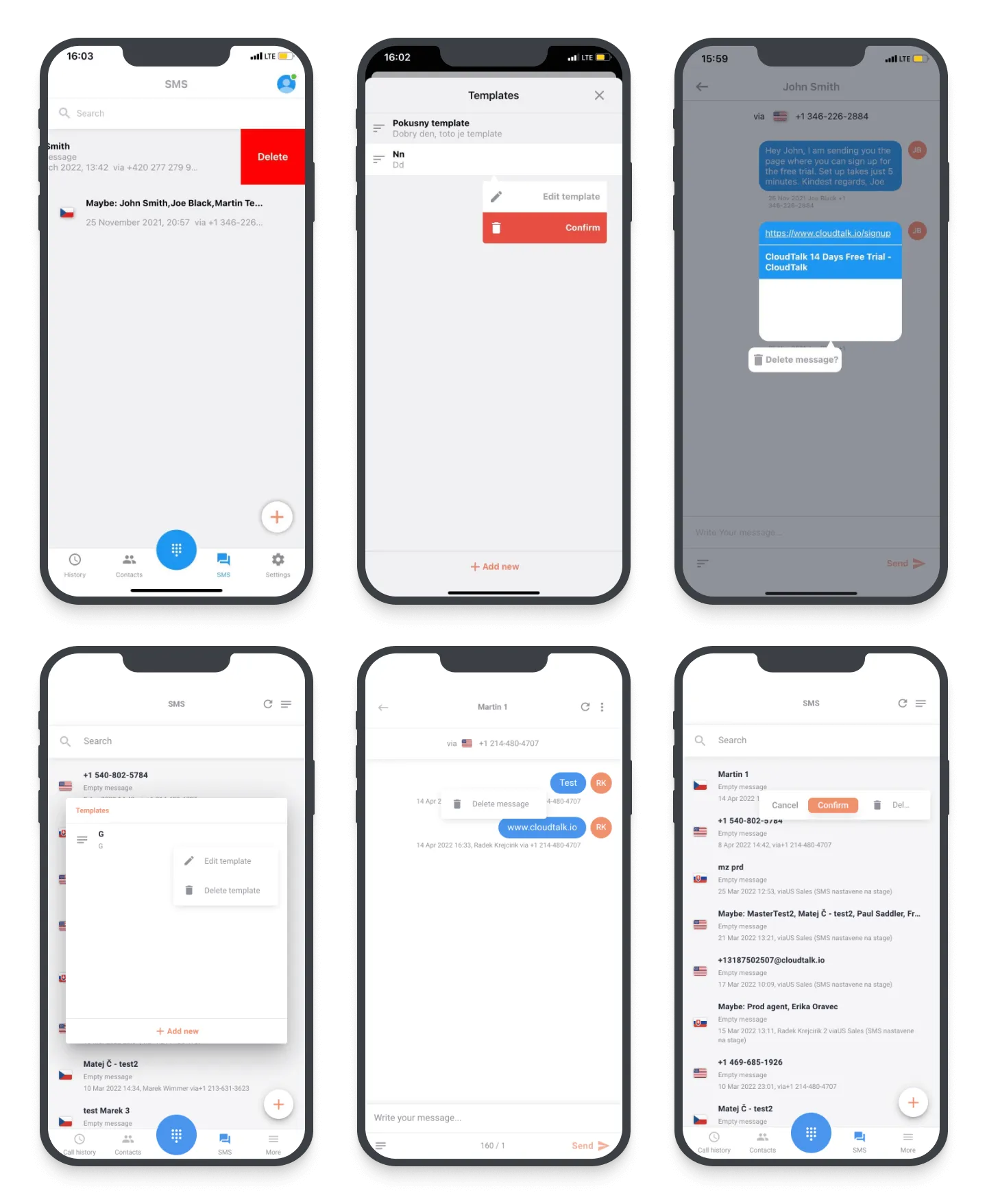 In this example, there is a large number of patterns used to delete an item from the list. You may see several cases for the same purpose.
Usability Testing
Usability testing is one of the most commonly used user research techniques, and it’s a great method for ensuring that your designs are easy to use. I had selected problems, but it was important to verify them with users to ensure that these issues were real.
 Task success rate was calculated using the formula where success = 100% and failure = 0%. In this test, I did not include partial success = 50% or other grades because the tasks were straightforward and mostly had one solution.
Task-based usability testing can identify potential problems when using an application. My primary goal was to confirm my hypotheses that I came across during the audit.
Test Results
The results of the testing turned out as expected. The task success rate was 27%, and users felt mostly negative when interacting with the user interface.
- Frustrated and felt unsure of what to do.
- Confused about how to find the right information.
- Overwhelmed with a large number of design patterns.
- Misunderstanding the behavior of the application.
- Uncertainty when controlling the application.
User Interviews
User interviews are one of the most flexible and adaptable methods—they are powerful tools for uncovering new opportunities and generating ideas during the discovery phase.
“What users say and what they do are different.”
— Jakob Nielsen, Usability Expert and co-founder of Nielsen Norman Group
Therefore, after receiving support from the management, I decided to conduct a few user interviews to gain a deeper understanding of the users’ needs, their pain points, and motivations.
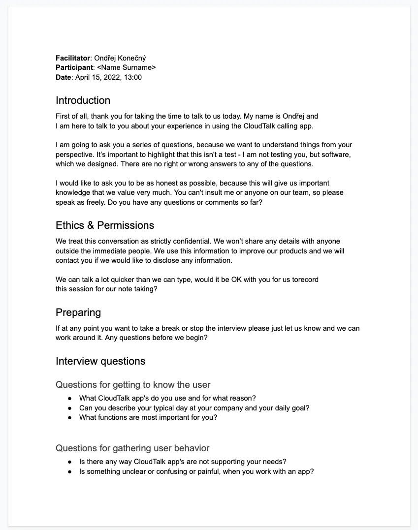 Structure of the interview script with Introduction, Ethics and Permissions, and Interviewing questions.
When I analyze research or present results, I always represent what participants have said and done honestly. I try to be open and listen to what participants are actually saying and doing. This might sound obvious, but it can be difficult in practice.
Getting More Feedback
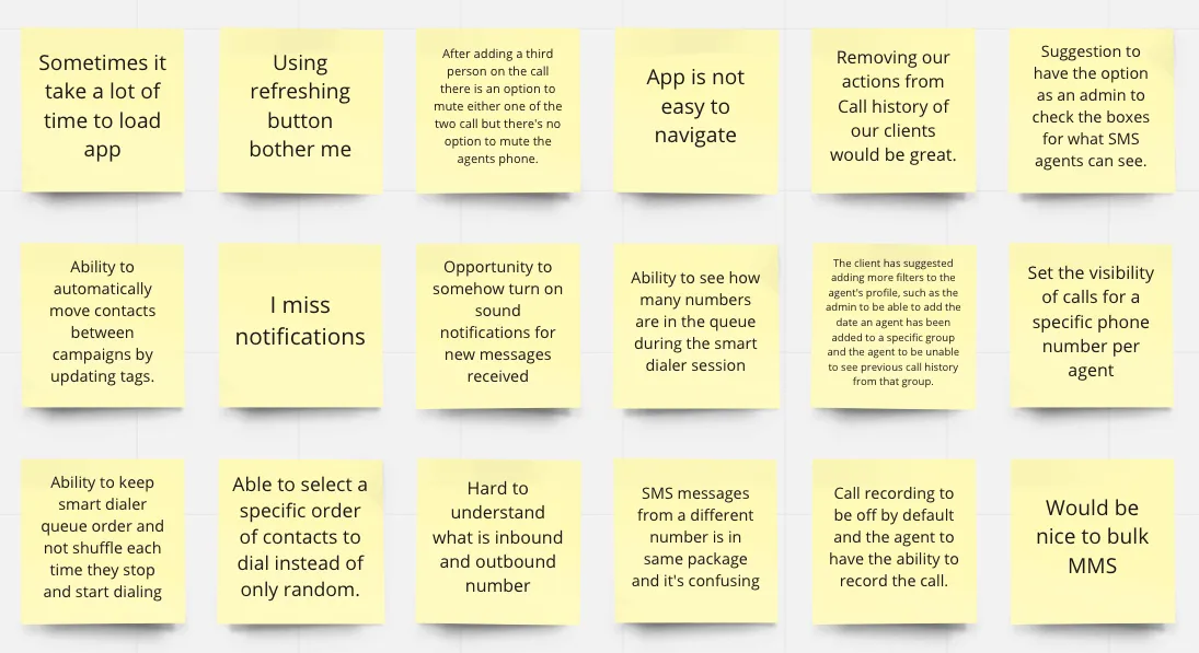
CloudTalk is really good at getting user feedback. Employees from the Customer Support team obtain a large amount of insights thanks to conversations with clients and various tools they use.
Everything then accumulates in our Productboard, so I spent several hours analyzing these insights, and again, this helped me complete the design puzzle.
Prioritization
We had to divide such a large task into several steps so that we would not have to wait unnecessarily long for the release of the redesign version. The whole process could take even a year, so it was better to combine big changes with small ones.
I plotted all outputs on the Impact–Effort Matrix, which helped us unify our thoughts in the team. The great advantage of this method is that it can be done really quickly, and each person can express their own opinion through a vote.
We decided that we would only redesign some screens and slightly modify others to prepare everything by the specific date. Once I had an overview of the scope, everything was ready for design work — improving information architecture was the first step.
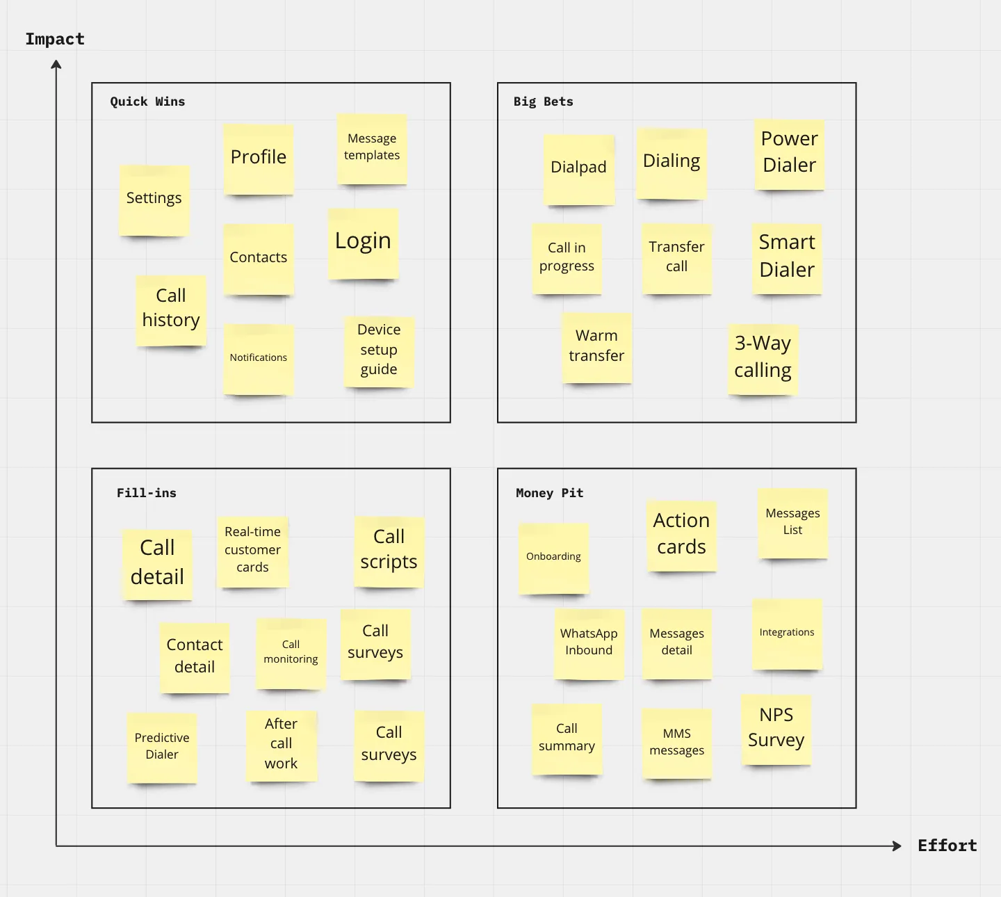 We have selected the areas of the application that have the most usability problems, are the most used, and are not difficult to redesign.
Prioritizing Observations
The observations revealed a lot of basic usability issues. It was obvious that the application needed to be rebuilt a little more than expected.
I grouped and consolidated another small package of insights I got from usability testing and user interviews. This was especially useful for other steps such as prioritization.
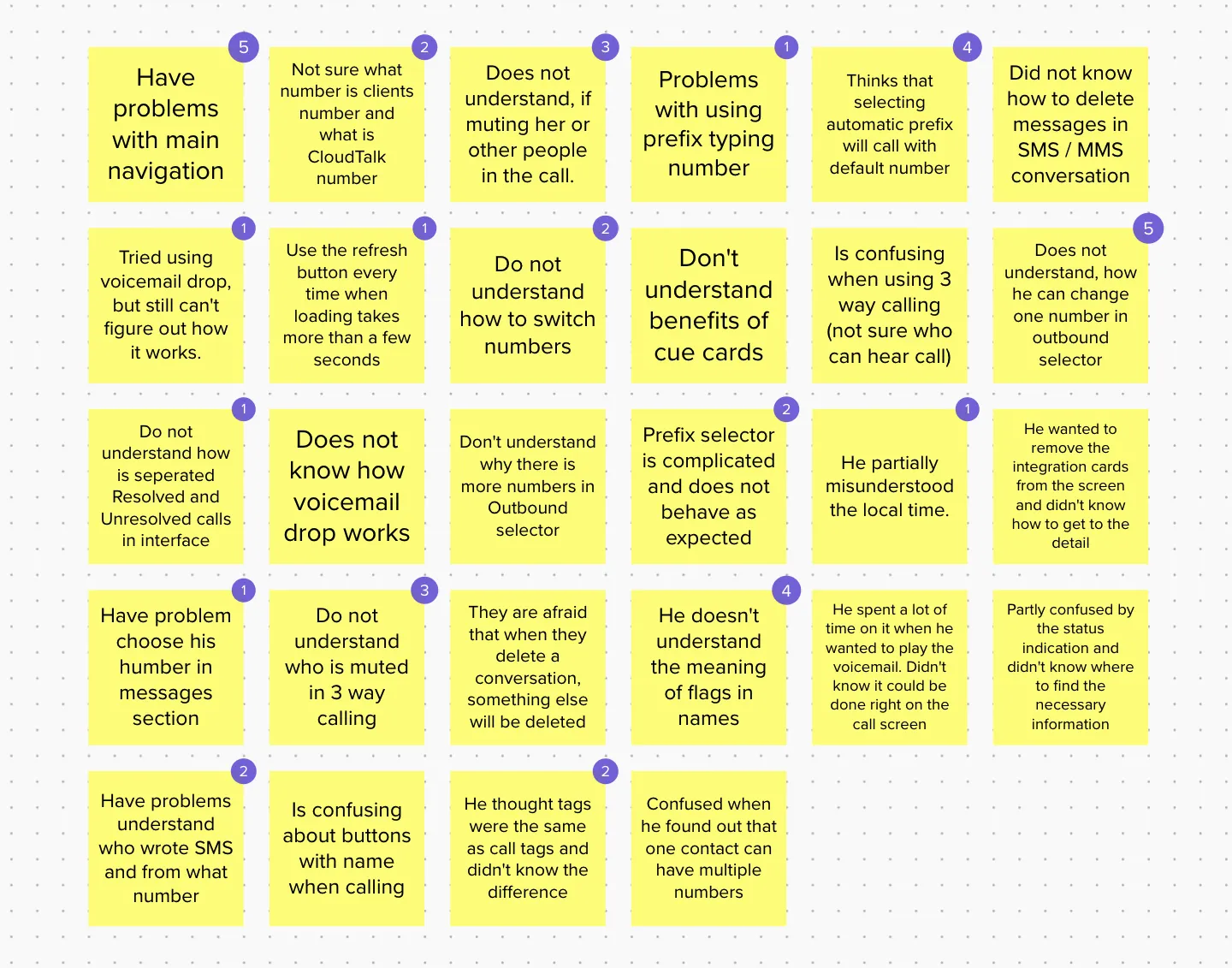 I grouped the notes from the observations into sticky notes, and used the Dot Voting method to select the problems we want to focus on.
Bird’s Eye View (Core Functionality Mapping)
Before starting any design, I spent a great deal of time making sense of workflows and existing content, and went through the app to ensure I was covering all screens and connections.
The structure of the application was quite shallow. It was a five-level menu, but the individual pages had complicated workflows and were not always completely understandable.
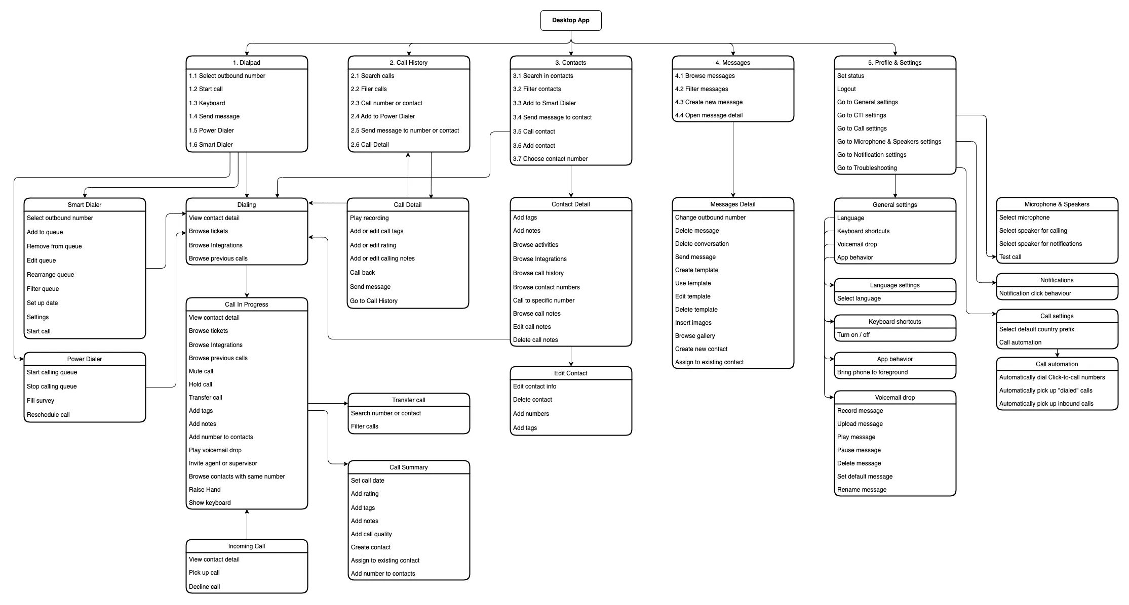
I thought about how to simplify the interface and not burden the user with information that is not relevant to them at the time. Removing confusing elements and unnecessary connections helped to improve the clarity of navigation in the application.
New Unified Experience
Once we had everything ready, I could start making changes to individual screens. We found the following areas to be problematic, so I focused on them the most:
- Design of individual components and patterns.
- Complicated workflows.
- Unintelligible navigation and structure.
- Overwhelmed screens with large amounts of information.
- Lack of accessibility.
- Unclear visual hierarchy.
- Poor color functions and combinations.
Rethinking Navigation
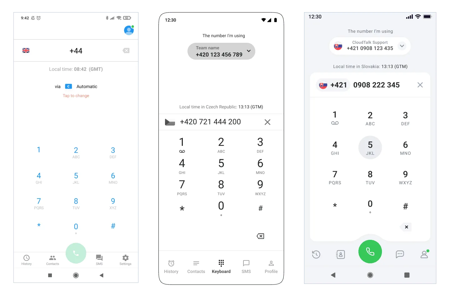
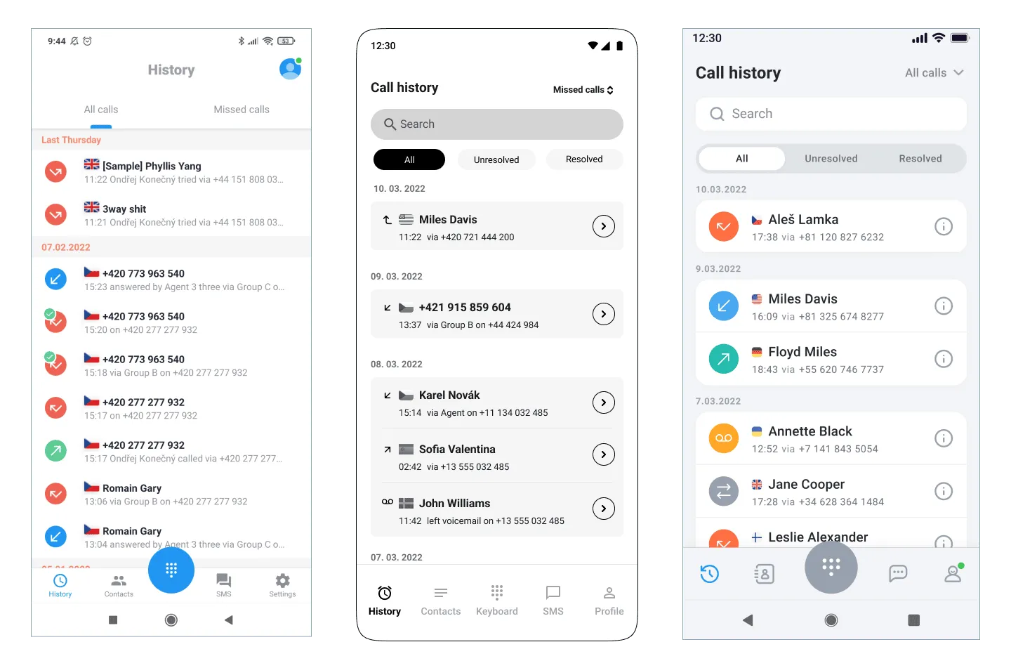
I started by exploring the structure of the menu together with the core layout and tried to find what could be improved. Several elements didn’t need to be displayed everywhere (which turned out to be a problem), because they didn’t have such an important function.
My goal was to simplify the base layout to get more space for content. The pages were still struggling with a small amount of space for important information.
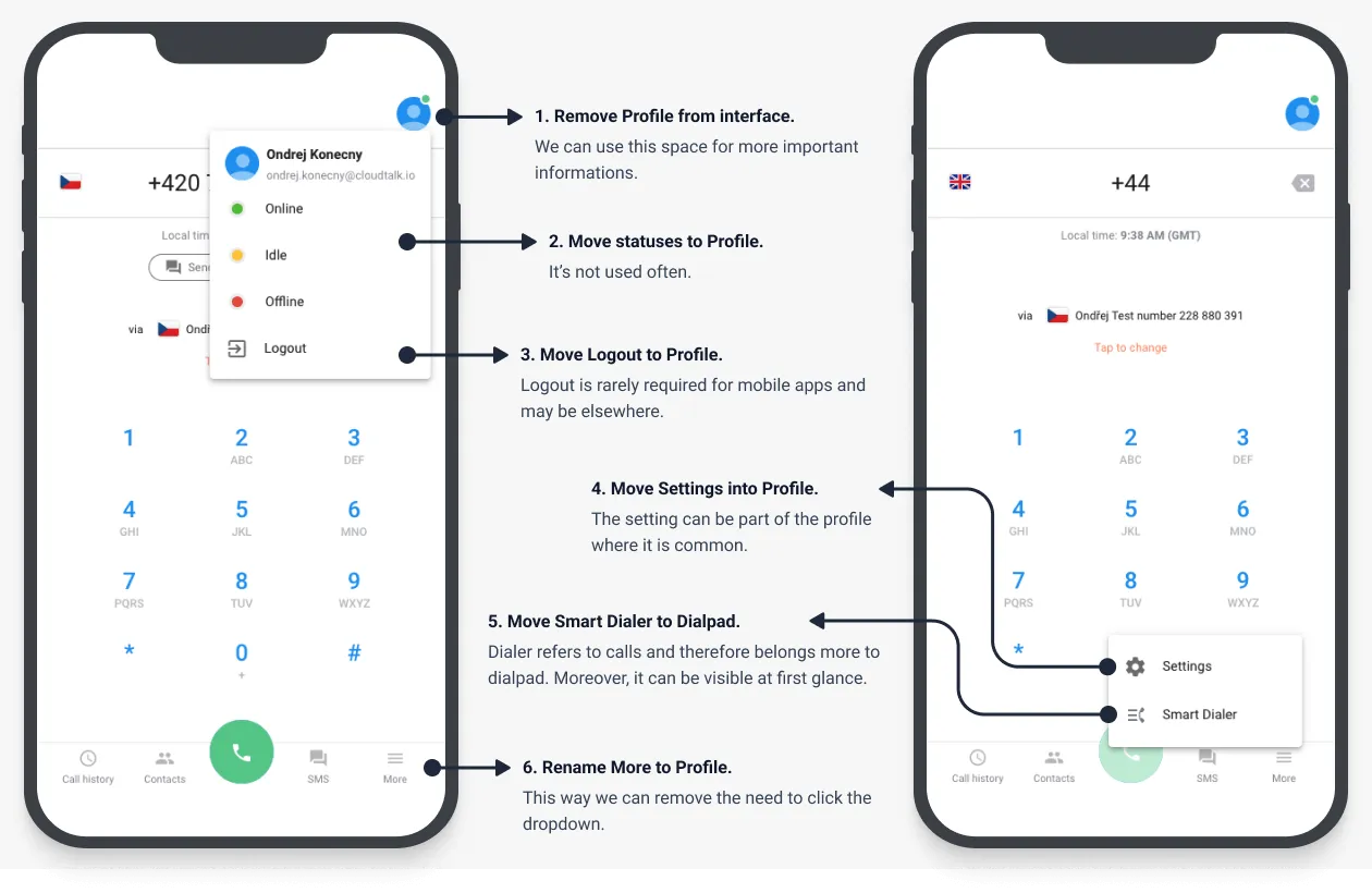
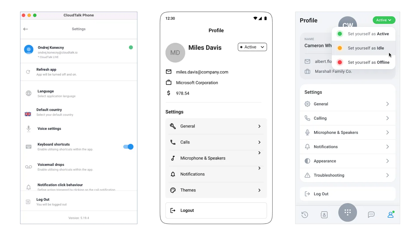
There were a few major issues with the current navigation and structure of the pages:
- The pages are struggling with a small amount of space for important functions (for example, filters), due to the profile section taking up a lot of space across the app.
- The More section doesn’t explain what it contains, but important settings are hidden there. In addition, functions related to the call are found there.
- The Profile section does not contain its details and is hidden under the Settings section.
- The structure is unnecessarily bushy and could be more straightforward.
 Yellow items are those that are not properly structured and that have been moved due to inappropriate placement in the interface.
The proposed updated navigation and structure of the pages were prepared. It was enough to organize the pages slightly and modify their names, and we achieved clearer navigation.
It is always better to have as simple a structure as possible with clear information architecture.
 Main structure and information architecture redesign.
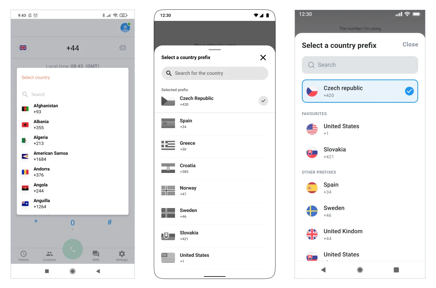
Redesigning Interface
Once we had the whole structure ready, I could start designing the interface. I always worked with lo-fi designs first so that I could discuss my ideas with the developers and also to avoid making adjustments in the final design.
