As part of the team driving the redesign process for our suite of products, I worked on improving existing features, creating a component library, conducting user research and usability testing, and building new functionalities.
Context
Renomia Universum is a suite of B2B products, used by brokers to compare different types of insurance. Brokers use the application to compare the offers of individual insurance companies and provide clients with the most advantageous offers.
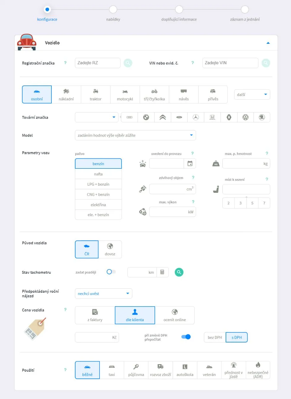 Screenshots from the original version of the Universum interface.
First steps
The first thing I did was gather context from colleagues who had been working on the project for some time. I asked them how they understood different parts of the product and whether they truly grasped it.
It was important to understand the technical limitations (e.g., dependencies on the APIs of individual insurance companies), project development progress, and also to identify what worked well and what didn’t.
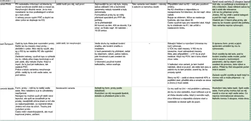
The evaluation of the questionnaire (in Czech) revealed that the main problems were missing design patterns, inconsistency in the use of visual elements, different behavior across components, unclear naming, and information overload.
Interface audit
I went through all the products and focused on the biggest issues that I personally noticed, regardless of how others perceive them. Unfortunately, a large number of errors appeared in the applications, which in some cases prevented users from purchasing insurance.
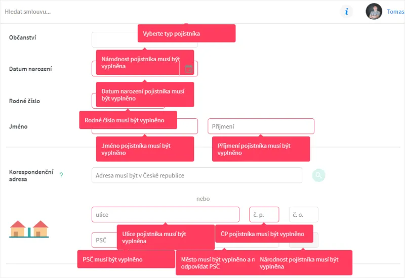 Additionally, in certain cases, the error messages overlapped with each other.
Users didn’t understand the required fields, and the way inline error messages functioned could block them from smoothly completing the form.
Research results
The analysis showed that it was necessary to address the most serious issues. The team decided to overhaul the concept and develop a new visual appearance based on the company identity.
Prototyping
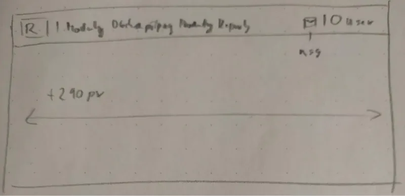
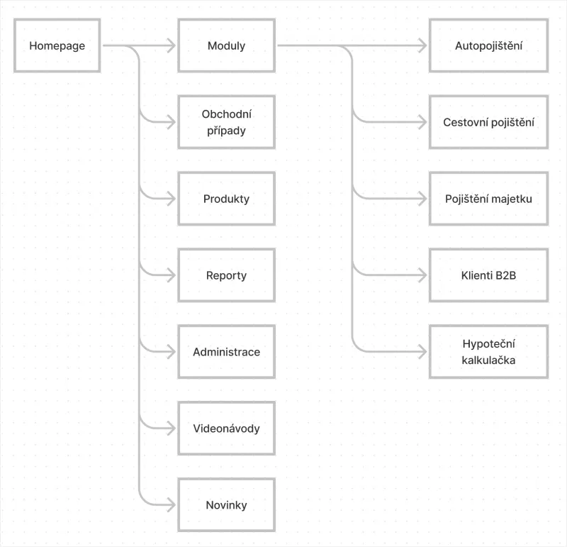
My first task was addressing the obvious problems in the app’s architecture. I conducted a content audit and organized the sitemap, removing redundant links across menus. We also eliminated non-functional elements, such as the search bar, and moved certain buttons outside the main navigation.
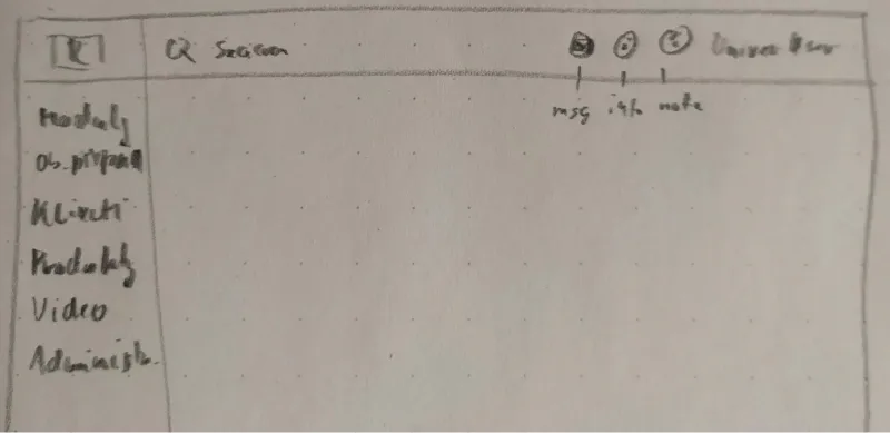


Polishing Information Architecture
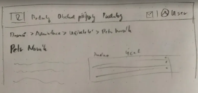
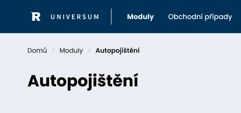
To make the app more readable and user-friendly, I simplified the sitemap, unifying modules, and introducing a breadcrumb navigation system for clarity.
Prototyping
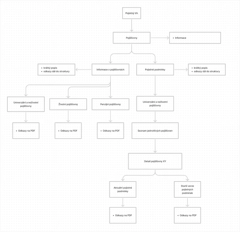
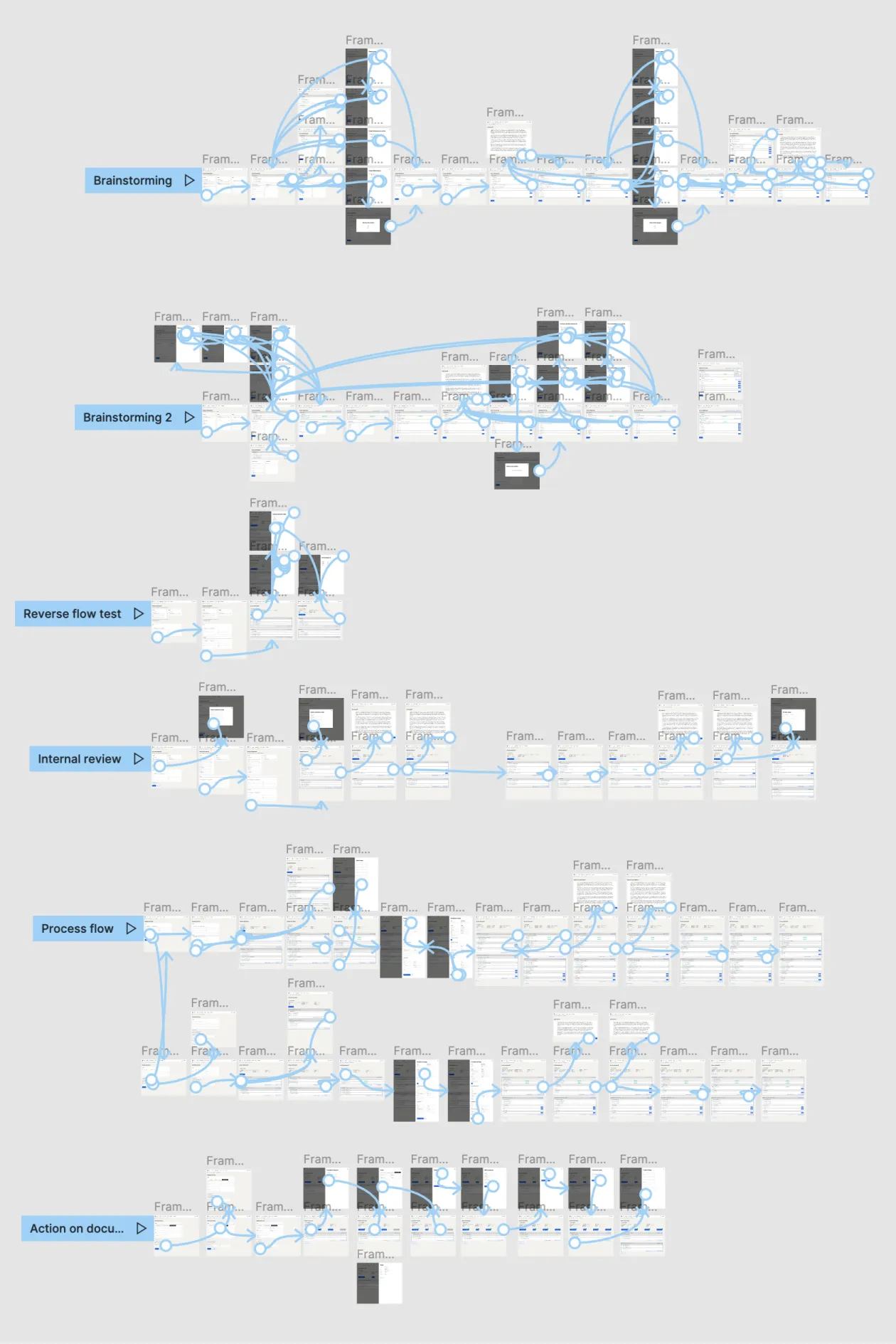
For some modules, it was essential to define the task flow and validate user passes. We ensured that the structure fits all products.
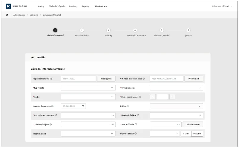
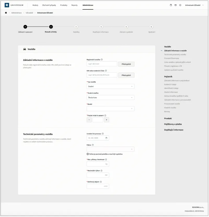
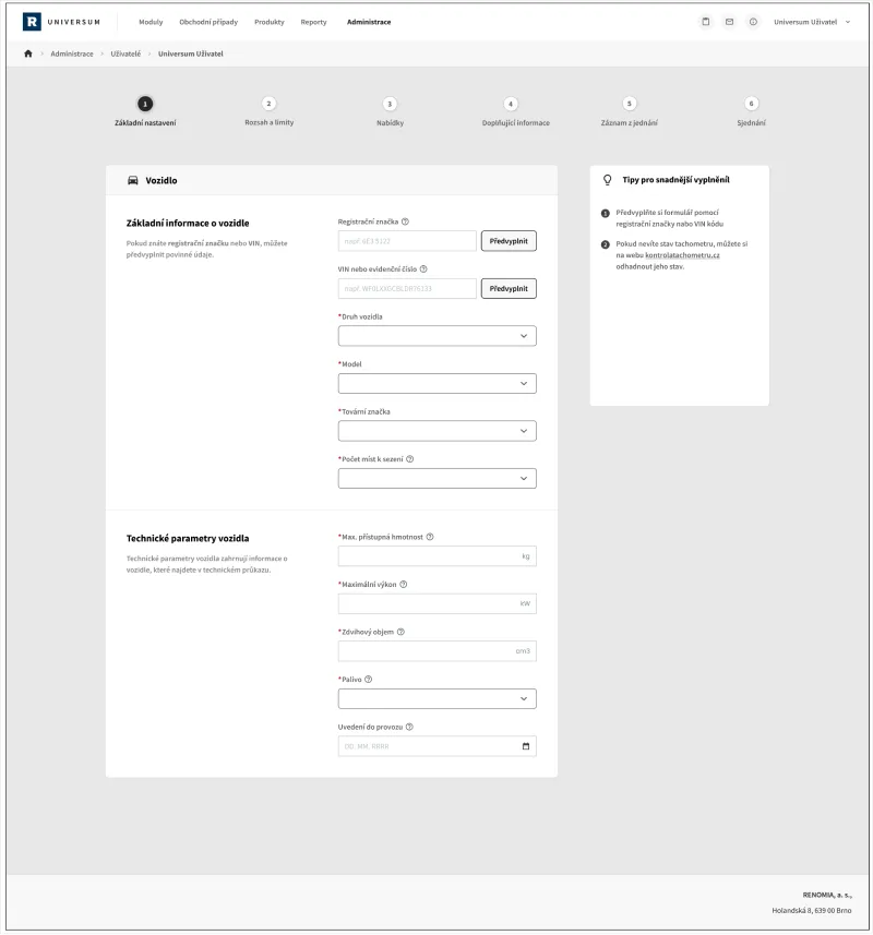
With all the research completed, I began sketching layout ideas with a focus on simple visuals and patterns that work across the suite.
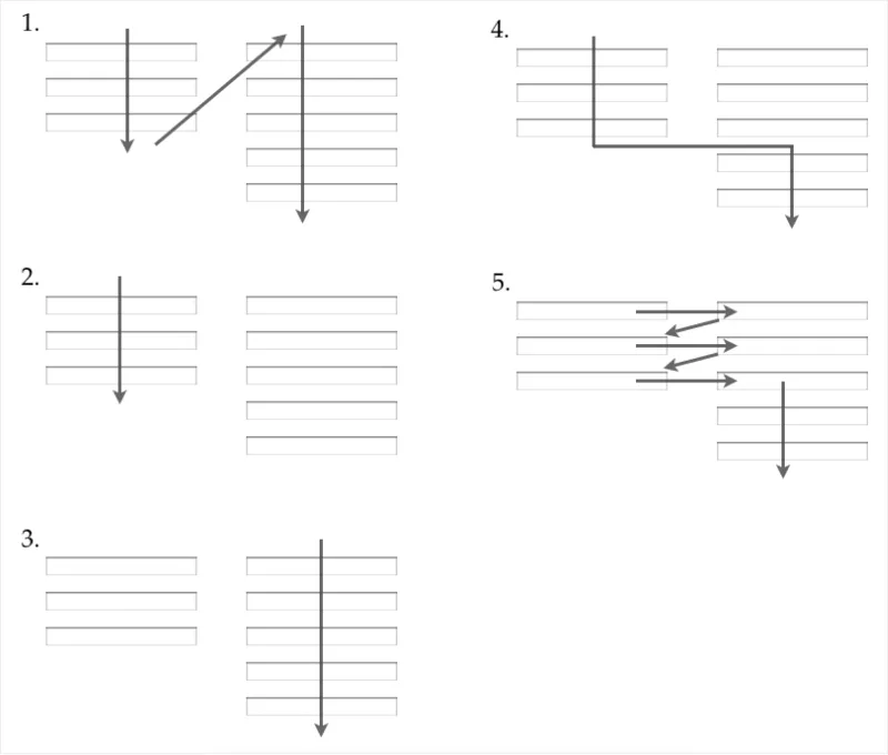
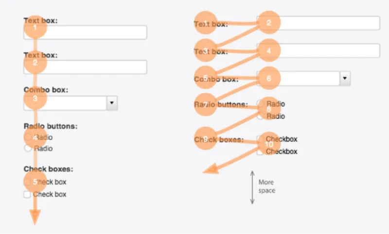
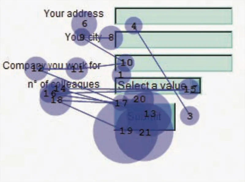
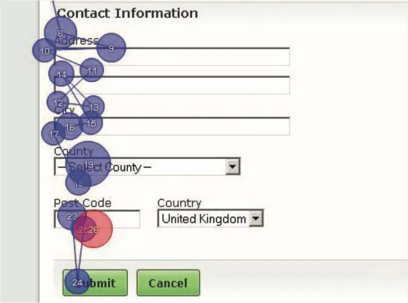
I’ve created several variants based on our discussions with developers, some of which were discarded due to platform limitations.
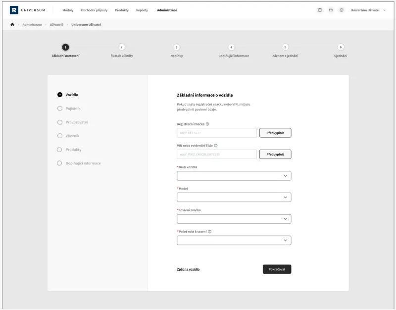
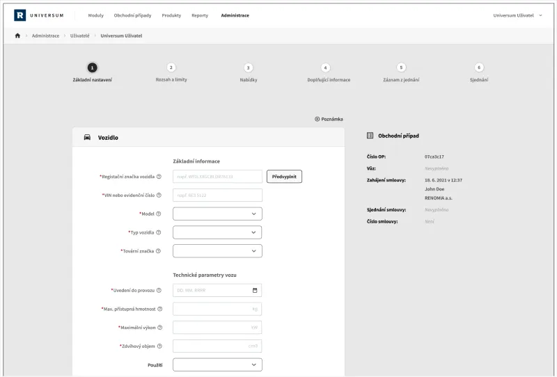
Test Results
The tests showed users preferred a clearer structure of forms with section descriptions. The progressive disclosure pattern was also rejected for not meeting the needs of call center employees. The progressive disclosure pattern was also rejected for not meeting the needs of call center employees.
Going Responsive
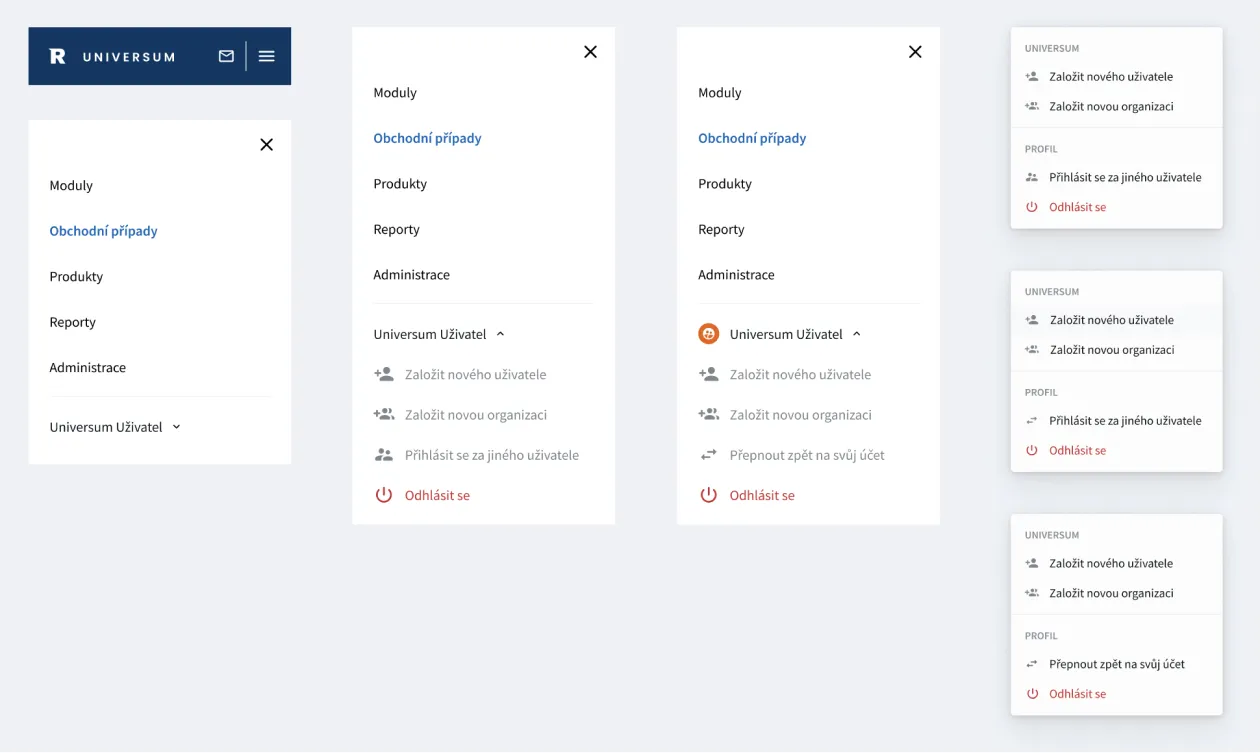
The user questionnaire revealed a desire to use the application on tablets and phones for minor contract modifications. I designed breakpoints based on analytics and research.


Visual Changes
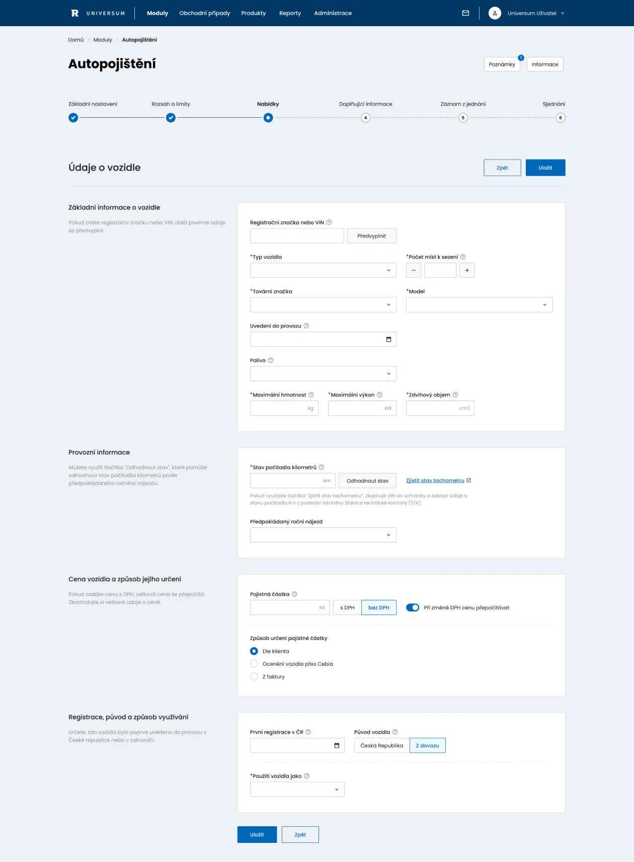
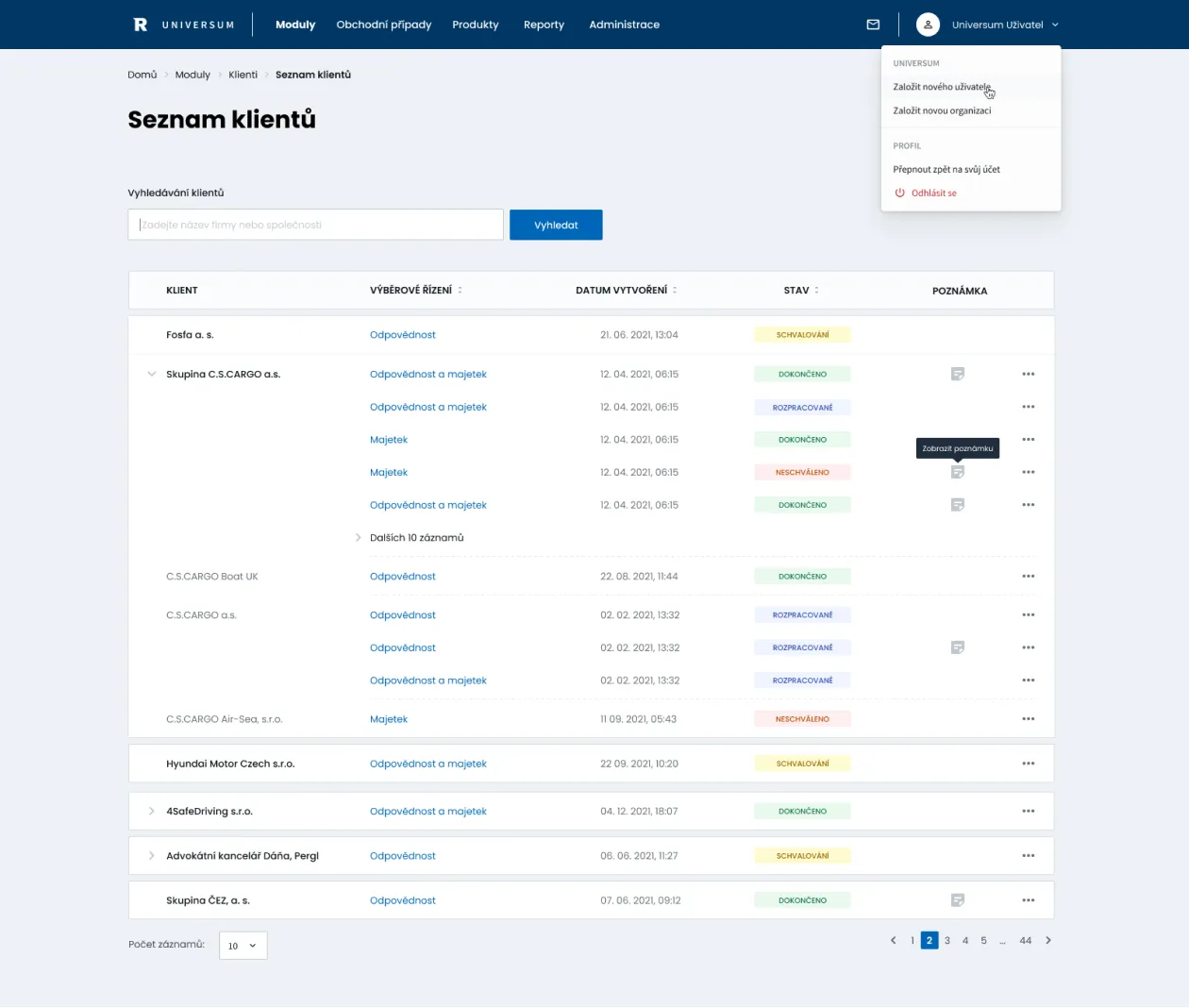
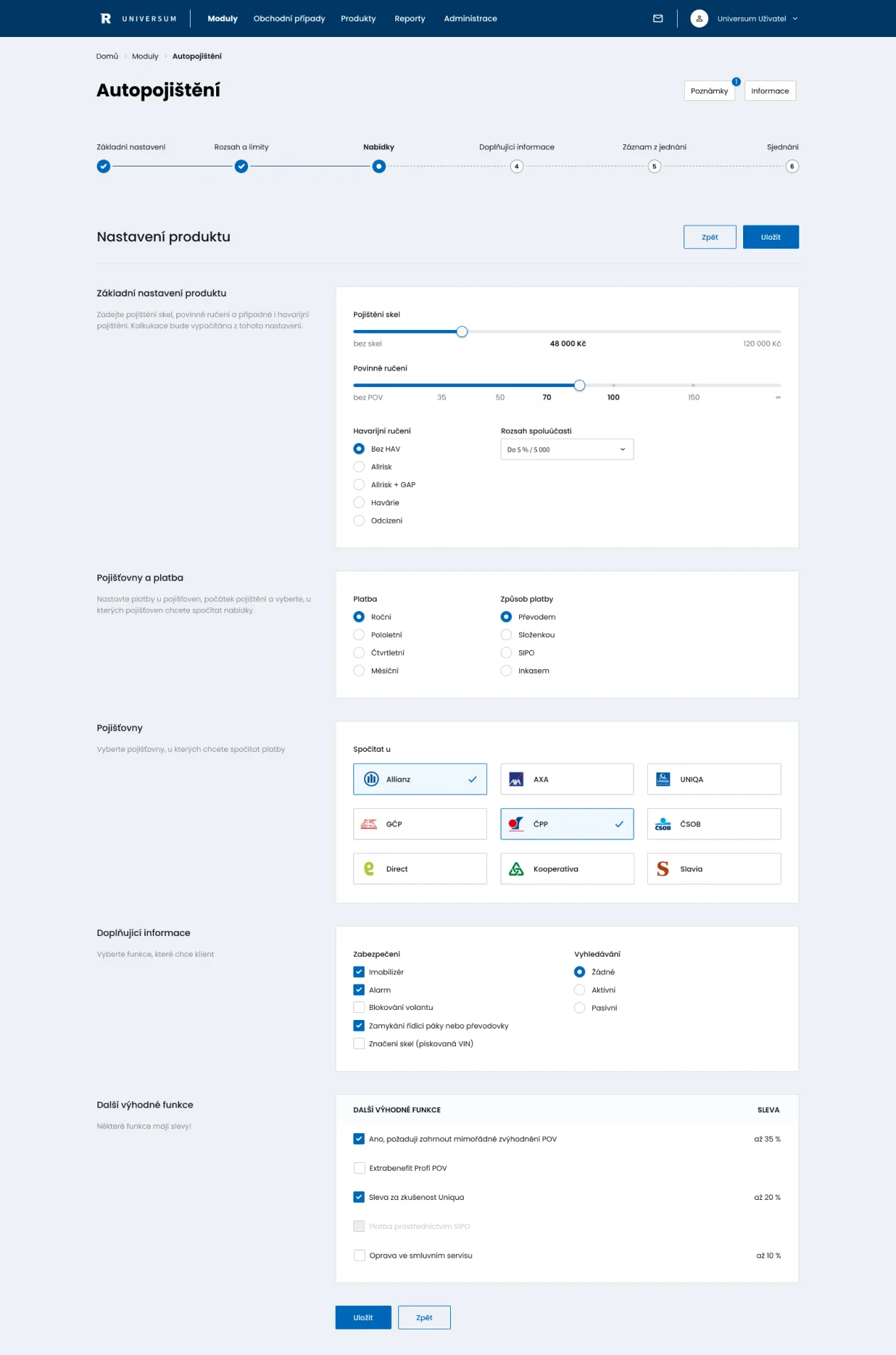
I began creating hi-fidelity prototypes to discuss visual directions with product managers, eventually choosing a minimalist, modern UI.
Design System Language
After finalizing the designs, the next step was to create a component library in Figma, set up design foundations, and complete the necessary documentation.
Interface Inventory
I started with a design audit, finding many inconsistencies in colors, typography, motions, and components.
Style Guide
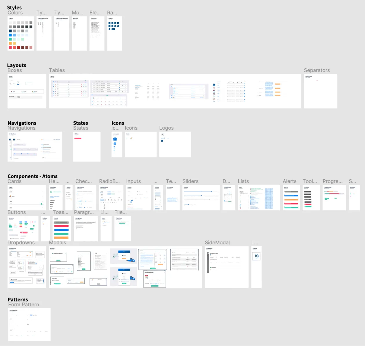
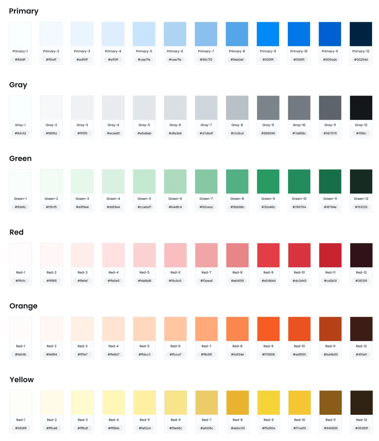
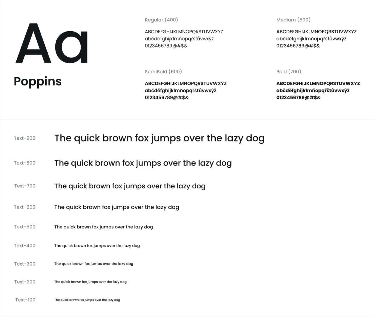
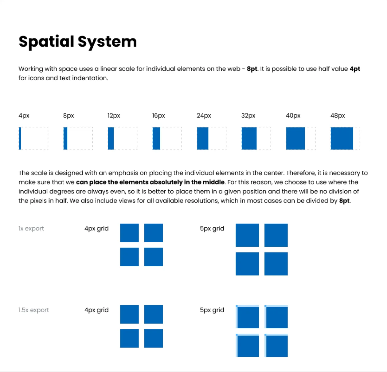
I designed a typographic scale, shadows, border radii, spacing, and chose the Radix Color system.
Component Library
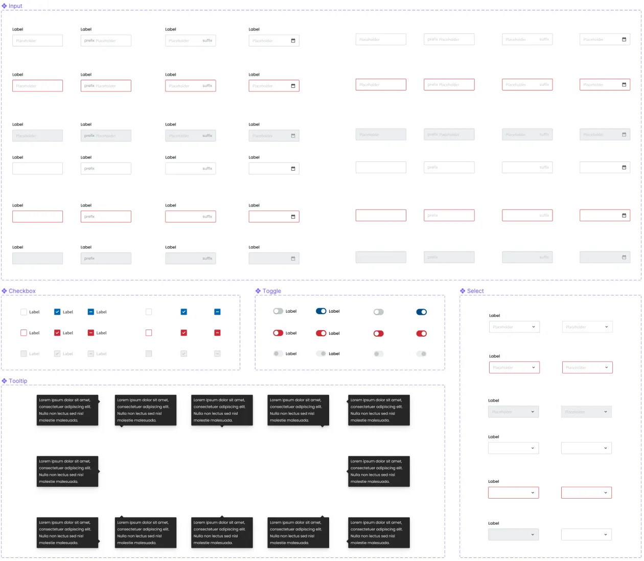
The main part of this work was to design the requested UI components in Figma and start distributing them across teams.
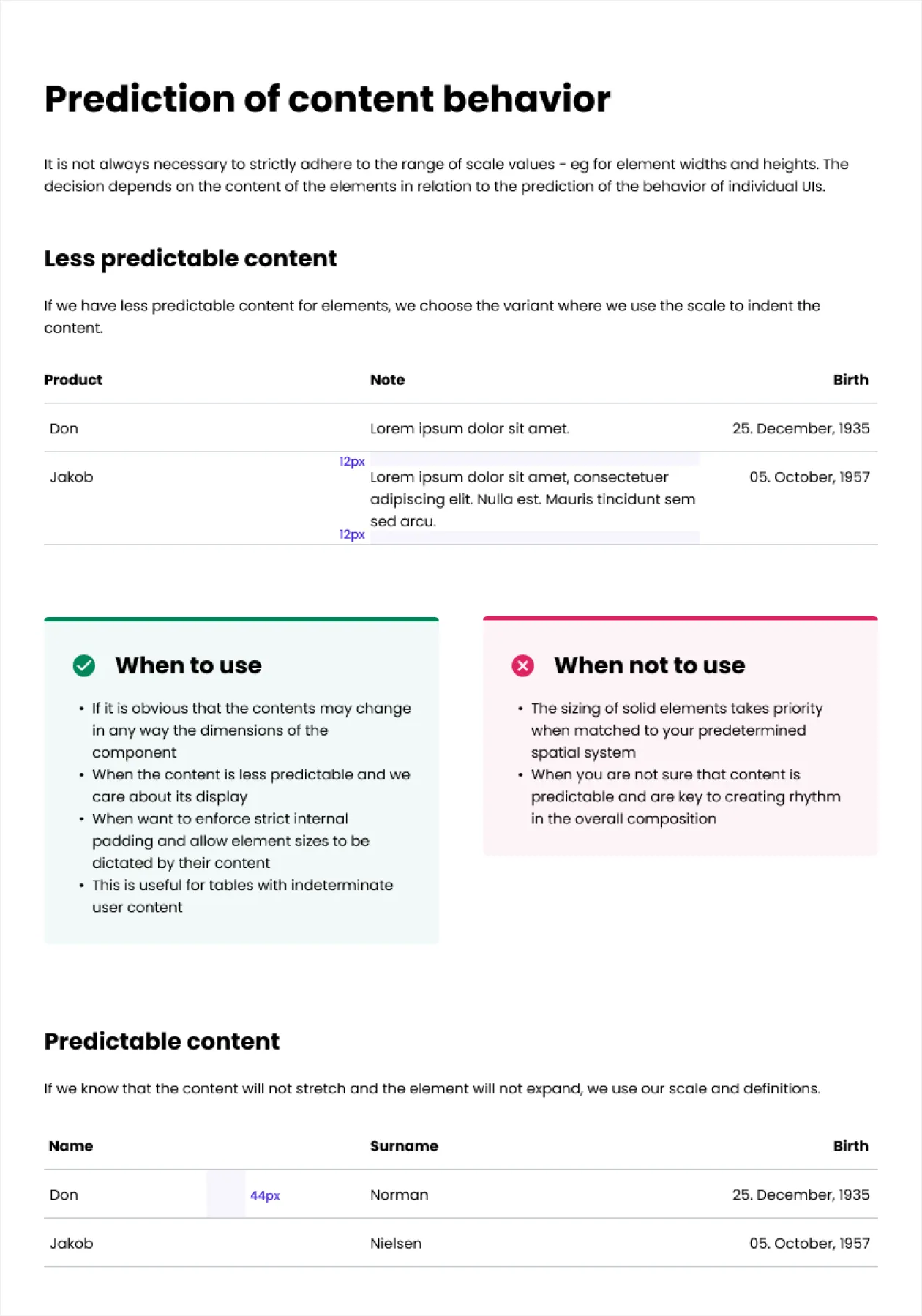
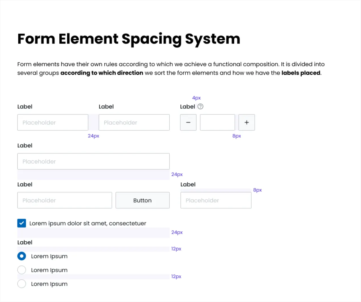
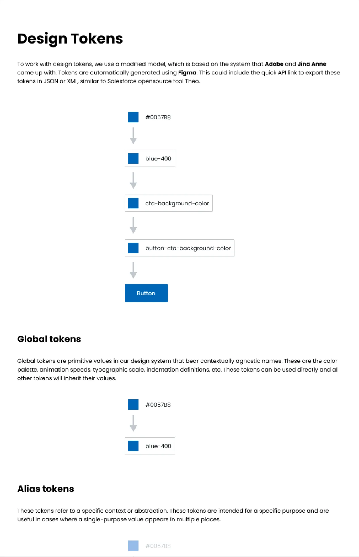
Documentation
An essential part of the redesign was documenting everything to facilitate onboarding for new team members.
Implementation
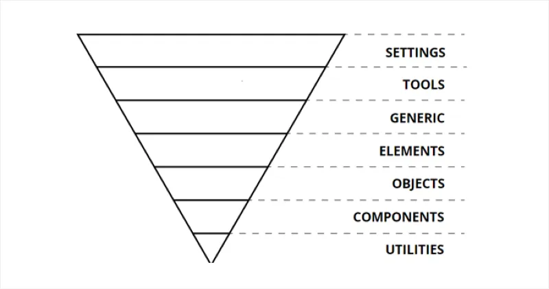
The designs were implemented in React, with styles written in Sass and CSS, following the ITCSS architecture.
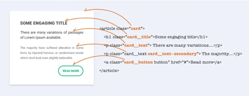
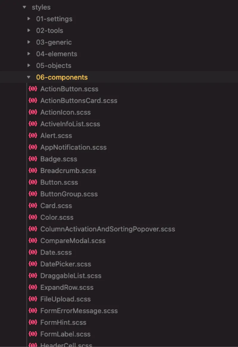
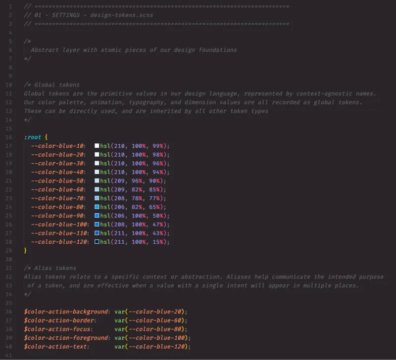
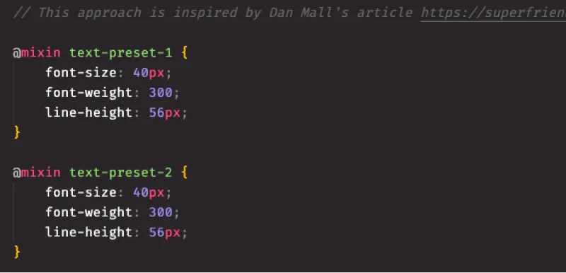
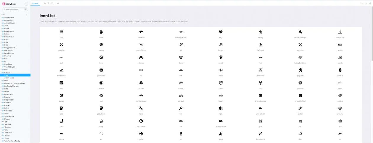
We used Storybook to develop UI components in isolation.
Conclusion
This redesign successfully addressed the core problems and simplified implementation. Although I didn’t see the final implementation, I consider this year-long sprint a success. Future improvements could include automating required data entries and adding keyboard shortcuts for faster navigation.
